Tag Archive for: interior design

Creating a Kid Friendly and Stylish Home

Kids-Play-Room-Design-with-Blackboard-and-Storage-600x288

I’m often asked this question: Can you create a home design plan for us that are both stylish and kid friendly? In my design practice, I am faced with this challenge all the time. For the most part, my clients have families with kids of various ages and requirements. My answer is yes, you can have a stylish home that is kid friendly as long as you plan well and purchase wisely.

Once you have decided on the design style you want for your interior, determine what spaces will be designated for the kid’s rooms and activities. Kids need to know there are places in your home where they are allowed to play safely and comfortably. Plan your budget for the project. Contrary to what you may think, you should invest in well constructed furnishings for the rooms that will get the most use from an active family. Plan on spending a good part of your budget on those rooms which are typically  the great room, family room and kid’s rooms. If you purchase furniture that looks OK but is not well made, you will end up having to replace them in a short time because they did not hold up. Poorly made furniture will simply not last. For upholstered furnishings, chose well made pieces and durable, strong fabrics that can be easily cleaned. Choose colors or patterns versus neutral colors that will maintain its new look longer. For tables and case goods, avoid glass tops and stick to stronger materials like solid wood. Use enamel based paint for your walls. Behr Paints has a flat enamel which is great as it has a nice flat finish and allows for easy cleaning. Be careful with the window treatments your chose for your home to avoid any strangulation dangers. Cordless shades, drapery panels and shutters are good choices. Consider wood or laminate flooring and tile throughout your home and use area rugs to add color, warmth and define seating areas. These types of flooring are initially more expensive than carpet but they are easier to keep clean and you will never have to replace them. Carpeting is a nice choice for the master bedroom and guest rooms that don’t get the heavy traffic that family rooms do.

Kid’s rooms and playrooms should be planned for safety and easy cleaning. Plan a room or space where the kids can spread out, be creative and have fun without worrying about them damaging furniture, walls, fabrics and carpet. The theme of the rooms can be determined by your kids favorite sports, heroes, characters, etc. and do not have to “match” the design style of the rest of the home. Keep the room bright and fun. If you choose a neutral wall color, you can easily and affordably change the theme with pictures and accessories as the kids grow and their “favorites” change. Try painting one wall with chalkboard paints. Kids can draw on the walls with chalk without causing any damage. Chalkboard paint now is available in colors, too. There is also a magnetic paint available that creates a surface that magnets adhere to for posting artwork, schoolwork, decorations and anything that can be hung by a magnet eliminating holes in your walls from nails and thumb tacks. Another great way to decorate walls is with decals. Wall decals come in a myriad of styles and are easily removed when the kids want to change the theme of their room. Ideally a kids room should provide your kids with a place to do artwork, play games, work on puzzles and projects (like a little table and chairs), floor space for play, plenty of storage, places to hang art and kid level hooks, bins or shelves that kids can easily reach. Don’t let the children’s toys devour every room in the house. If you plan adequate storage in their rooms, kids can clean up after play time and save you a lot of time picking up allowing you to maintain a stylish, kid-friendly home.

Cynthia Champness Cuellar, IDS is the principle Designer and owner of Rancho Interior Design.

You can contact her at 951-956-0661 or email her at Cynthia@ranchointeriordesign.com

Give Your Tract Home a Custom Look

alt-homebanner.png

Custom built homes are designed according to the clients’ specifications and have a unique style and appearance inside and out. Tract home interiors and exteriors on the other hand are all very similar but can be given a custom look with the help of a design professional, a little imagination and a lot of attention to detail. This can all be done on a modest budget without making major structural changes.

I was recently contacted by a young couple from Virginia, Brittney and Zach Osborne who are purchasing a home in Canyon Hills, Lake Elsinore.  It is very important for me to learn as much as possible about my clients so I can design a home that reflects their taste and lifestyle. I had the couple complete our custom questionnaire so I could learn about their design style, their needs, their likes and dislikes, their vision for the home and very importantly, their budget. Brittney is a Registered Nurse and Zach is a professional motocross racer.  They described their design style as casual and contemporary and wanted to create a custom look for their home that feels inviting and comfortable. They like to entertain and expect to have a lot of out of town guests visit often. They described themselves as outgoing, fairly laid back and enjoy the outdoors. They plan for kids and animals in the future so I had to keep that in mind while selecting fabrics and furnishings for them. They like neutral, timeless, warm colors and modern style furnishings.

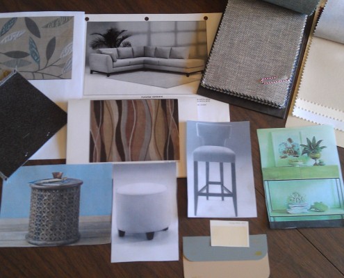
We began the design process by choosing the color palette for the entire house. With their lifestyle in mind I decided to give them a “Modern Nature” theme incorporating colors borrowed from nature and natural textures and materials.  After measuring the home I developed a floor plan for each room and selected furnishings, window treatments, lighting and accessories keeping in mind the function, style and mood of each space.

IMAG0247

Watching the house transformation has been exciting for my clients and I was able to make decisions and share the progress with them all via the internet! I will be featuring the finished rooms in their home over the next few months. This month we will look at the Great Room’s design transformation.

The Great Room

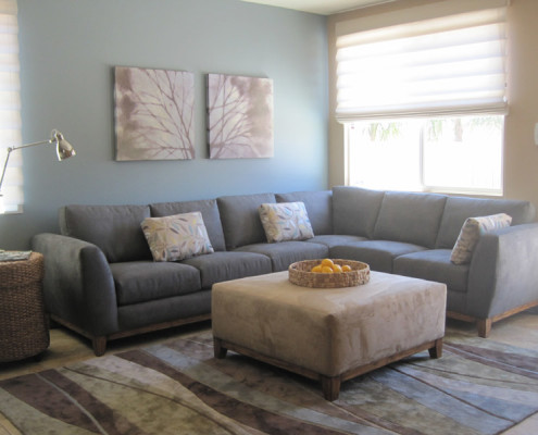
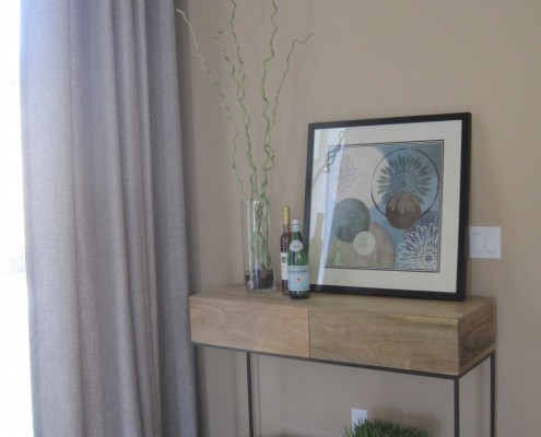
The Great Room will be the place where Brittney and Zach do a lot of entertaining. The color palette for this room includes warm beiges, grey, blue and green with black accents. I chose 2 walls to paint in an accent color of Stone Fence (Behr paint). The couple required a lot of seating so I chose a custom sectional sofa in a soft, flannel grey upholstery fabric, which will be durable and easy to clean. A large ottoman in beige ultra suede fabric was chosen instead of a traditional cocktail table and can serve as an ottoman, table or extra seating.  Pillows add color and a nature pattern to the sofa. A wicker side table was chosen and adds another natural element to the space.  A comfy, gorgeous area rug defines the seating area and incorporates all the colors of our palette. Three custom barstools upholstered in beige and grey tweed fabric were chosen for additional seating at the bar. The room had a large open niche where we installed a custom designed Maple entertainment cabinet for TV and components. A rustic console table next to the slider back door provides a drop off spot and can display photos, cookbooks, etc.

IMG_2204

For the windows and French door I chose off-white Roman shades which I love. They are pretty, stylish and provide diffused light and privacy. The slider was treated with a functional grommet top drapery fabricated in a beautiful iridescent blue fabric.  To be sure we had adequate lighting in the room we added six recessed ceiling lights and under cabinet lighting in the kitchen and a modern fan was installed in the center of the room.

The most important finishing touches in any room are accessories. For art we chose a pair of canvas prints which feature soft tree branch images in tones of beiges and greens coordinating with the area rug colors perfectly. A modern clock, silver tree sculpture and inspirational art are featured over the fireplace. Family photos will add a personal touch throughout the room.

IMG_2168

The finished room carries out the “Modern Nature” theme with relaxing colors, natural materials, and nature images. The room offers ample, comfortable seating and plenty of room for entertaining guests.
Remember that details in design, including custom paint colors, custom cabinets, upgraded flooring, lighting, window treatments and furnishings all help to achieve that custom look for any home.

Cynthia Champness Cuellar is the owner and principle designer of Rancho Interior Design.

Contact her at 951-956-0661 or ranchointeriordesign.com


Entryway Ideas for Your Home

Entryway-idea

Dear Cynthia,

My design dilemma is this. My front door always looks a mess and it’s the first thing you see when you come into my home. The kids always drop their stuff-shoes, backpacks, bags, toys right down by the front door when they come home. What can I do about making this space look nicer?

Alice, Murrieta

Dear Alice,

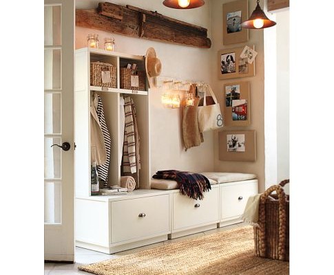
Keeping your front or back entry neat is always a challenge when you have kids and husbands! Back East a lot of homes are built with what is called a mud room that is off the back entry. The concept of a mud room was to have a room where you could come inside and remove your muddy, wet boots and coats and not dirty the living spaces. Most of us here in California don’t have the luxury of a mud room so we have to come up with other ways to organize the clutter. First look at your entryway and determine what kind of space you have where you could create a storage area. Analyze the types of items that you need to organize. Do you need containers, boxes, and hanging space?  Design the area in an attractive cohesive way that complements the rest of your room/home.  If there is room for a piece of furniture consider purchasing an entry storage bench. Pottery Barn has a nice one. Their Brady 4-piece double bench entryway system is perfect for organizing the entryway. The unit has room for hanging jackets, drawers for toys, shoes, etc., bins for storing school supplies and a bench where you can sit and remove your shoes. They offer several different options and different sizes of units. You can add more hooks for additional directly on the wall. Decorate the space around the unit with wall art and framed photos and add interesting pendant lights for style and adequate light. Now the space is organized and attractive not just a mound of clutter. If space is limited you can still achieve an organized area incorporating shelves, using large baskets and decorative hooks that can be found at any hardware store. You might even search for vintage pieces at local antique shops.  Just be sure to decorate the space so it blends in with your home décor and becomes an attractive area that complements your home.


Creating Interesting Ceilings

I came across this article from Houzz and wanted to share it with my bloggers. It has some good ideas so I hope you enjoy it. Just follow the link below to see the article. I welcome your comments.

http://www.houzz.com/ideabooks/2239846/list?utm_source=Houzz&utm_campaign=u98&utm_medium=email&utm_content=gallery0